With TV being a visual medium and all, it’s not surprising that many shows utilize some sort of promotional poster for advertising purposes.

You’ve seen them before – as magazine ads, on billboards, or plastered on the side of a bus. I always notice them most often in the late summer, right before the kickoff of the traditional broadcast TV season.
And while most of these ‘posters’ are perfectly adequate in creating brand awareness or taking up ad space, many don’t strive for anything beyond mediocrity. The standard seems to be a heavily photo-shopped cast shot, a seemingly clever tag line, and the title of the show. (See the Chicago Fire poster to the right.)
Some series however have really embraced the art of the TV promotional poster, creating visually striking images or clever homages:
 |
 |
 |
|
And then there’s a few marketing departments that go above and beyond.
Community has always been one to do things differently, so its no surprise that the series has inspired some amusing artwork over the years from its fans and marketing departments alike.
Remember the first time NBC tried to remove Community from their schedule? That led to these cool posters from graphic artist Jon Defreest.
More recently, Sony Pictures Television created a bunch of parody posters to nudge NBC to renew the series in order to help the Greendale gang fulfill their destiny of #sixseasonsandamovie.
 |
 |
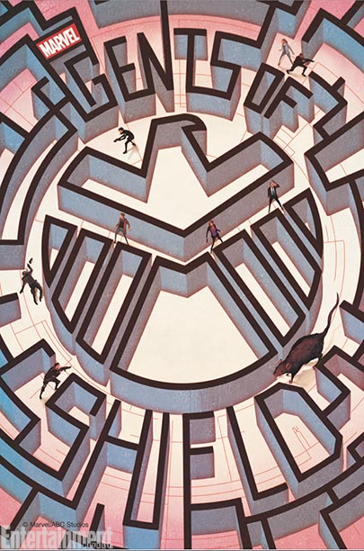
And then there’s Marvel’s Agents of S.H.I.E.L.D., a show that had a stereotypical promotional poster and an equally lackluster start.
 But boy have the tides changed.
Despite a disjointed airing schedule in the beginning of 2014, Agents of S.H.I.E.L.D. began to find itself, just in time for Captain America: The Winter Soldier to shake things up and let it’s Marvel Cinematic Universe #itsallconnected promise payoff.
And with its new found momentum came a consecutive airing schedule and “Marvel’s Agents of S.H.I.E.L.D.: The Art of Level Seven” – a new piece of art for each of the remaining six episodes, each by a different popular comic book artist.
Which is not only a cool way to tease what’s to come, but also an intelligent way to connect it back to it’s comic book roots.
 |
 |
 |
 |
Bottom line, I know that for all intents and purposes these works of art are advertising based, but that doesn’t mean I can’t appreciate the few that go above and beyond the bare minimum to create something clever.


